Digipak artwork ideas and research
02:50
Idea 1
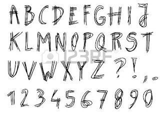
For our album artwork, I think we should go with something simplistic yet bold. For the reason that they are an alternative band and care a lot about their music, I don't think we should show their faces. The bright colours and messiness of the design should reflect how the band are fun loving and the type of energy their songs in the albums have. Here are some examples of similar images, digipaks that should influence us when making our digipak. We need to make sure that we think about the type of audience that we are wanting to attract and if the artwork fits the star image we are wanting to show.
 |
| Alt J- This is all yours. |
 |
| Nicki Minaj- The Pink Print |
Idea 2
For our second idea, we were thinking that we could have a group photo of the band messing around on the front with some digital drawings over it- looking as if its a photo taken on a film camera and in a scrapbook. On the inside cover, we would include polaroids of each band member as babies with digital drawings over showing their personalities and the instruments they play in the band.
Here are a few examples of the type of style we would go for.


