My Draft Album Artwork
13:53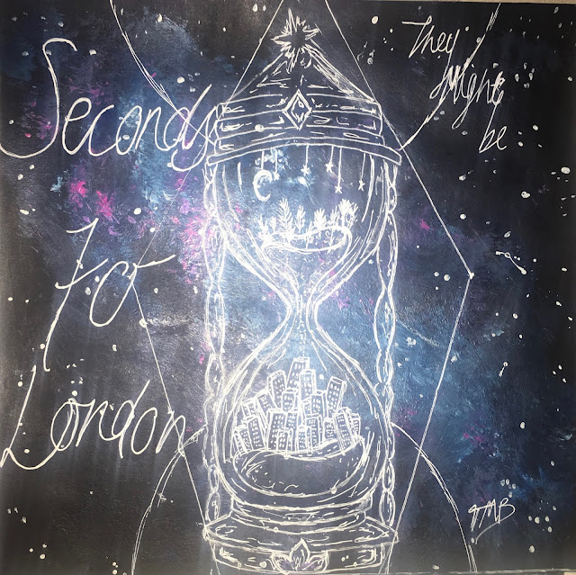


I have included the vital information that needs to be given on an album cover, this including the band and album name, the track list, artwork, a barcode, the record label, and the copyright.
In this album cover, the most important things being are the band, the name of their album and the bands products (the songs on the back). I made these things stand out by the size of the font, the positioning and the colour used. For example "Seconds to London" is in the biggest font as the main thing being advertised on the cover is the Album- it draws the audiences attention to the writing making people want to look further into it. I have gone for an illustrated cover that I have painted myself, the reason for this is because I wanted it to be organic and imperfect, this is because I wanted to show the band is indie and quirky, targeting quite a young generation that is influenced by the arts and are accepting of imperfections. It is then more relatable for the audience. I have painted an indie, galaxy style background with a design of a minute timer on top in white gel pen, inside the drawing there is countryside in the top, the sand represents the seconds going down and then at the bottom there is a city, representing London. This is an image of what the title of the album is trying to say. It suggest the bands roots and where they are now, and also the difference between the countryside and location. It also suggests that the band is again quite quirky and creative and alternative. I used black, blues and purples in my album cover so that it was eye catchy and not too simple. I used a white gel pen to do the writing and illustration on top so that it would be clear and stand out over the darker background.
 For font, I looked for inspiration online. I liked the look of this font on the 1001fonts website and wrote in a style similar to it. I think it again reinforces the idea of organic and imperfect to give the impression that the band likes uniqueness and natural things, implying the band is indie. The target audience would pick up the album because of the interest in the indie design, colours and how the genre of the band is clear. Younger generations, so current teenagers (like myself) would be attracted to the album because it is different and unique, in my opinion a lot of people my age are more accepting of different and quirky art choices therefore I feel they would have a liking to this album cover. I am showing that the band is indie-rock by the use of quite dark colours and the use of hand drawn, indie drawing alongside font that isn't neat and wouldn't usually be seen on an album. These conventions all making it easier for the audience to recognise the genre of the album and the type of things they would expect from the band. I have constructed a "star image" for the band by including their signature on the front, this making the audience feel its more personal to them and feel as though they have received something from someone that is influential. I also included on the back that they are signed to island records, who have many other artists signed to them, such as: Justin Bieber and Shawn Mendes, who both target a similar audience. This putting them up there with all the other "star images" that have been created for other artists, making the band seem as though they are better and cooler than the audience. I made the choice of not using the artists faces, this works with Dyers theory. The second paradox states that the artist/band should be both absent and present. By the absence of their faces it makes them remain anonymous and will want the audience to look into the Band more. It also proves that the bands are such "stars" that they don't need their faces on the cover to get the recognition they need. And lastly, it shows that they are in it for the music, not popularity from their looks.
Overall, I think I represented the genre well through the album cover and it would attract the target audience. I am happy with the artwork and the representation it has linking to the band and the album. If I were to improve the cover in anyway, I would add more legal information for example the year of release and the producers and i would maybe accentuate the rock side as i think it is evident it is indie but it could be made slightly clearer that it is an indie-rock band.


