My Homepage
14:58
I have made a homepage for the Band Kodaline using WIX and here is the link to the site: https://daisyjelley0.wixsite.com/kodalinehome

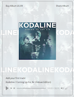
On my website there are many conventions I have used to suggest the music genre and also portray the band as stars. To start off, when I edited the background, I chose to include the bands latest album cover. I chose to include multiple images of it to emphasise the importance of it, creating a "star" image. To go alongside this, I wrote my titles in a similar font to the font used on the album cover and I inserted the music video for one of the albums singles "Honest", this creating an overall buzz for the album. I made the options that take you to other pages at the top a similar colour to the background so that everything worked well together and looked tidy.
 As you scroll down the page, I have included tour dates, The album alongside its price and an "about us" section. The reason for me putting all of these things on the home page is to allow the focus to be all on the band and their latest album. All of this creates a "star image", supporting Dyers theory, as it makes the band seem of more importance to the reader as it shows them as cool because they are doing concerts which you can by tickets to see and they are also successful because they are selling an album on different platforms. I chose to put these things on my site because of the research I did when comparing the other home pages. Both the home pages previously have this information therefore proving it is vital to give this information in order to market the artist or band and their music successfully. Similarly, the link titles at the top of the page are similar to those used on both the Bruno Mars and The Beach Boys' home pages. At the bottom of the homepage.
I have given links to the other social media platforms you can find out more about the band or stay up to date with the band, these include:Facebook, Twitter, Instagram and youtube and email. I also linked these symbols to their actual social media pages so that it is easily accessible for the audience.

 Throughout the homepage, the band appear as 'stars' as what they do, make and where they are are proven to be important to the audience. The audience will be attracted to this site by the use of images or videos that they may've already seen (the album artwork and the "Honest" music video). The colours are also eye catching and the website is colour co-ordinated which is visually appealing to the audience. The target audience would be attracted to this homepage as it gives the main things about the band and that the band are offering which they would have an interest in. For example, they must have an interest in the band and their music if they clicked on the site, therefore, providing them with the tour dates on the home page could make them more likely to want to purchase tickets and see them live and giving the pricing of the album on the site could make them consider buying it- which again gives them that "star image".


