Lip Sync
13:15
In the studio, we had three different sets;
- one with a green screen and a sofa
- one with neon lighting panels
- one in an apartment setting.
We assigned each other different roles, such as: Floor manager, playback, camera man, performer and director. These roles allowed it to be filmed properly and meant we were able to edit the film in time to the music. The director would take charge of what the cameramen and performers are doing, the performers and cameramen would do as they are told, the playback would take charge of playing the song and the floor manager would make sure everyone is ready and everything is going to plan. We learnt how to use the dolly safely, capturing everything we needed. We also learnt to focus on the play back before then focusing on the performers, this meaning the video could sync up perfectly with the music.
In the editing suite, we started off by organising and naming our rushes and then syncing each up to the music. To do this we looked at the timer that the playback held which we made sure to focus on at the start of each shot whenever we were able to so that we could sync it perfectly to the music, at points we were unable to do this method as the camera was set facing a different direction (this problem occurred on the green screen set), when this happened, we listened to the snare drum and synced it as closely as we could to that. Making sure that the music and video is synced up perfectly is vital so this is what we spent the most time doing. One thing our grouped struggled with was continuity with editing, we tried to come up with as many original ideas on set as we could by using the set in different ways or performing different routines but there wasn't many angles of the same shots. This meaning there wasn't much of an order to our video. Once we selected parts we thought were best for each section of the song, we cut and pasted the footage into a timeline which eventually turned into a longer video. We made sure to keep saving the video as we went to ensure all of the edited video didn't get lost. Editing this lip sync was more challenging for us than when making our thrillers because of the troubles with continuity and making sure it is constantly in sync with the lyrics.
Next time we will make sure to get lots of shots of the same action to ensure the video has good continuity so that the video visually looks better and the cuts would be more effective and cleaner. This tasked helped me to prepare by letting me practice syncing the music to the video and by viewing the mistakes we made and how we can change them.
My Draft Album Artwork
13:53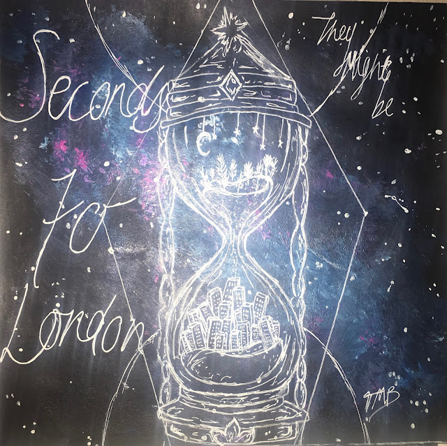


I have included the vital information that needs to be given on an album cover, this including the band and album name, the track list, artwork, a barcode, the record label, and the copyright.
In this album cover, the most important things being are the band, the name of their album and the bands products (the songs on the back). I made these things stand out by the size of the font, the positioning and the colour used. For example "Seconds to London" is in the biggest font as the main thing being advertised on the cover is the Album- it draws the audiences attention to the writing making people want to look further into it. I have gone for an illustrated cover that I have painted myself, the reason for this is because I wanted it to be organic and imperfect, this is because I wanted to show the band is indie and quirky, targeting quite a young generation that is influenced by the arts and are accepting of imperfections. It is then more relatable for the audience. I have painted an indie, galaxy style background with a design of a minute timer on top in white gel pen, inside the drawing there is countryside in the top, the sand represents the seconds going down and then at the bottom there is a city, representing London. This is an image of what the title of the album is trying to say. It suggest the bands roots and where they are now, and also the difference between the countryside and location. It also suggests that the band is again quite quirky and creative and alternative. I used black, blues and purples in my album cover so that it was eye catchy and not too simple. I used a white gel pen to do the writing and illustration on top so that it would be clear and stand out over the darker background.
 For font, I looked for inspiration online. I liked the look of this font on the 1001fonts website and wrote in a style similar to it. I think it again reinforces the idea of organic and imperfect to give the impression that the band likes uniqueness and natural things, implying the band is indie. The target audience would pick up the album because of the interest in the indie design, colours and how the genre of the band is clear. Younger generations, so current teenagers (like myself) would be attracted to the album because it is different and unique, in my opinion a lot of people my age are more accepting of different and quirky art choices therefore I feel they would have a liking to this album cover. I am showing that the band is indie-rock by the use of quite dark colours and the use of hand drawn, indie drawing alongside font that isn't neat and wouldn't usually be seen on an album. These conventions all making it easier for the audience to recognise the genre of the album and the type of things they would expect from the band. I have constructed a "star image" for the band by including their signature on the front, this making the audience feel its more personal to them and feel as though they have received something from someone that is influential. I also included on the back that they are signed to island records, who have many other artists signed to them, such as: Justin Bieber and Shawn Mendes, who both target a similar audience. This putting them up there with all the other "star images" that have been created for other artists, making the band seem as though they are better and cooler than the audience. I made the choice of not using the artists faces, this works with Dyers theory. The second paradox states that the artist/band should be both absent and present. By the absence of their faces it makes them remain anonymous and will want the audience to look into the Band more. It also proves that the bands are such "stars" that they don't need their faces on the cover to get the recognition they need. And lastly, it shows that they are in it for the music, not popularity from their looks.
Overall, I think I represented the genre well through the album cover and it would attract the target audience. I am happy with the artwork and the representation it has linking to the band and the album. If I were to improve the cover in anyway, I would add more legal information for example the year of release and the producers and i would maybe accentuate the rock side as i think it is evident it is indie but it could be made slightly clearer that it is an indie-rock band.
Designing my 1st Draft Album artwork
14:01
Band name: They might be
Album name: Seconds to London
Genre: Indie Rock
Record Label: Island Records
Track List:
- Nocturnal Interference
- Nothing but Persuasion
- Secret Joy
- Blue
- Crying Vandals
- Ineptitude
- Rule go Height
- Tell
- Ruby Delusion
- Steel Tears
- Vivacious
- Want
Below are some photos I took during the planning and designing process of my Album cover.
 |
| A design of the type of shape the design will be and the placement. |
 |
| A more detailed design, alongside placement ideas and font ideas. |
 |
| A sketch of the design for the back cover of the album and song name ideas. |
What is on Album?
03:11
There is key information that needs to be on the album cover. I have made a collage of words including what should be displayed on an album.
 Also, heres a list to make it clear what should be included:
Legal information: copyright, year of release, studio, producers etc.
Record label (usually the logo as well)
Warning (if necessary) "explicit content"
Artist name/ band name
Album name
Artwork/ photo
Barcode
Track/ song list
Albums and its artwork are made for many reasons. It attracts a specific audience, it displays the genre, it markets/ sells the artist, it builds the "star" image and it is way of exhibiting the product.
My Homepage
14:58
I have made a homepage for the Band Kodaline using WIX and here is the link to the site: https://daisyjelley0.wixsite.com/kodalinehome

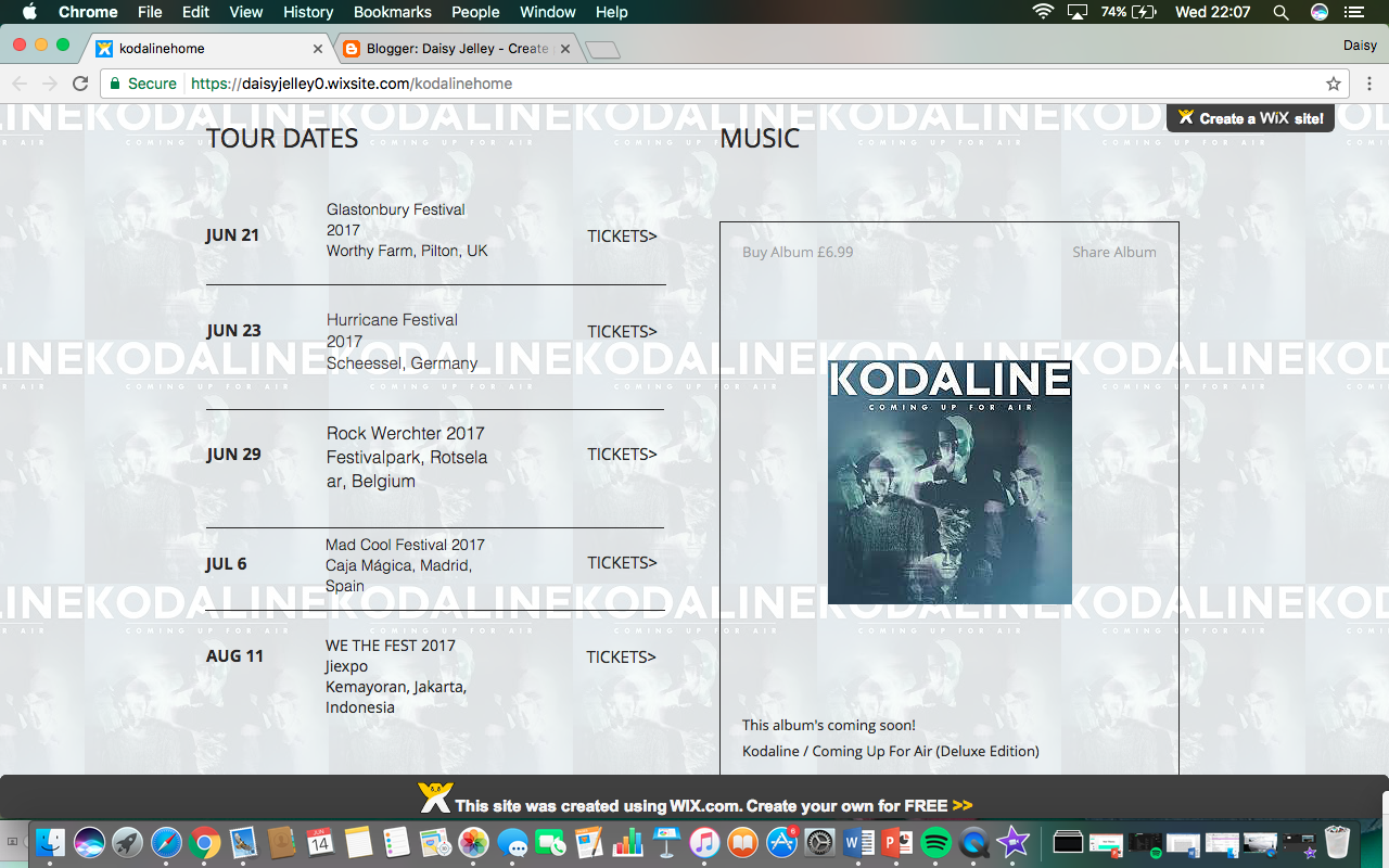

On my website there are many conventions I have used to suggest the music genre and also portray the band as stars. To start off, when I edited the background, I chose to include the bands latest album cover. I chose to include multiple images of it to emphasise the importance of it, creating a "star" image. To go alongside this, I wrote my titles in a similar font to the font used on the album cover and I inserted the music video for one of the albums singles "Honest", this creating an overall buzz for the album. I made the options that take you to other pages at the top a similar colour to the background so that everything worked well together and looked tidy.

 As you scroll down the page, I have included tour dates, The album alongside its price and an "about us" section. The reason for me putting all of these things on the home page is to allow the focus to be all on the band and their latest album. All of this creates a "star image", supporting Dyers theory, as it makes the band seem of more importance to the reader as it shows them as cool because they are doing concerts which you can by tickets to see and they are also successful because they are selling an album on different platforms. I chose to put these things on my site because of the research I did when comparing the other home pages. Both the home pages previously have this information therefore proving it is vital to give this information in order to market the artist or band and their music successfully. Similarly, the link titles at the top of the page are similar to those used on both the Bruno Mars and The Beach Boys' home pages. At the bottom of the homepage.
I have given links to the other social media platforms you can find out more about the band or stay up to date with the band, these include:Facebook, Twitter, Instagram and youtube and email. I also linked these symbols to their actual social media pages so that it is easily accessible for the audience.


 Throughout the homepage, the band appear as 'stars' as what they do, make and where they are are proven to be important to the audience. The audience will be attracted to this site by the use of images or videos that they may've already seen (the album artwork and the "Honest" music video). The colours are also eye catching and the website is colour co-ordinated which is visually appealing to the audience. The target audience would be attracted to this homepage as it gives the main things about the band and that the band are offering which they would have an interest in. For example, they must have an interest in the band and their music if they clicked on the site, therefore, providing them with the tour dates on the home page could make them more likely to want to purchase tickets and see them live and giving the pricing of the album on the site could make them consider buying it- which again gives them that "star image".
Designing my practice Homepage
04:28

What have you learnt from Wix?
From Wix, I have learnt that it is easy to create a website that displays exactly what you want for an artist depending on the genre and style. There are many ways in which a website can sell an artists products and it is a great way to do so whilst also creating a star image for the band. On Wix, you can move pages around, change colour schemes, add images, sell products and is a great way to portray an artist to an audience.

How i've applied conventions?
I applied the genre conventions by the use of showing the bands latest video on the homepage, adding tour dates and a section that allows you to buy the tickets to see them live, a news page, an about section, merchandise and a contact us section. The background includes images of their album artwork. I have made the font of the title of the band similar to the title on the album artwork so that it all links together. All of these qualities alongside using the form of a multi-page website, creates a star image for the artist. Audience have easy access to a range of information about them and can even book a live experience of their music on the page. This could lead to fans wanting to buy their merchandise.

What worked well and why?
Each page had different and important information on that audience members would like to find out about. For example: tour dates, news about what the band are doing/ what has happened. It is a great way of displaying their new song/album, for example- the youtube video comes up straight away and on another page there is a way of buying the album. The Aesthetic all matched keeping to a light blue theme.

What are websites and how are they used?
14:04
Websites
Different websites have different purposes depending on the intended audience. There are many positives to making a website, these include: they are cheap and easy to use and create, has access to a large international audience (potentially around 3 billion people), it is another (free) form of marketing and distribution, they can constantly updated and edited (almost live).
When looking at websites, most people judge the website on its home page therefore the homepage needs to include many things to create a good impression of the band/ audience on the audience that are looking at their websites. The home page needs to entice you/ attract the audience so that they would want to carry on browsing the website. The genre should be clear and it should be easy to navigate.
The Beach Boys
 First of all, from looking at the home page, I can immediately identify that the target audience is the older generation that were teenagers of the 60's (especially girls). Evidence for this is the old photograph of the band members which would reinforce their memories of the era. In this case it would be teenage girls attracted to these "stars" of the time. There is also a title stating the album "pet sounds"is 50 years old to again catch the audiences attention as their music was made so long ago. This also enforces the star theory as it is stating that the album is still being listened to now, even though its so old, creating a star image for the band as is exaggerates their significance to music. The fact the images used on their homepage were taken a long time ago suggests that they are legendary figures and want to be remembered how they were, keeping the same audience through the years. The band title is done in the recognisable font that was commonly used by them which acted as a logo to identify the band; the blue colour of the writing tells the audience that it is a boy band. The overall message the site is trying to express is how the band will always want to be known as their youthful, fun selves and they don't want to destroy their image for their audience. Their home page also features their latest news, their featured products, and how to keep updated via email and their social networking links.

Bruno Mars
 When looking at the home page for the Bruno Mars website, it includes all the key things that will promote the Artist. There are links at the top to direct the audience to the different sections of his website. His titles are in bold and clear making the audience instantly read what it says. In fact, His new singles title is bigger than his own name as a way of drawing attention to it, making peoples eyes go to the 'thats what I like" which could lead to them wanting to hear the single or even buy it. Alongside this, there is a clip from the music video playing in the background- marketing the artists products even more. As you scroll down, there are links you can click on to watch or buy his videos/ music and the formats you can buy it in. He has also included some of his merchandise and tour dates all on his home page which is easy to navigate. At the bottom, there are his social media links and places you can listen to his music leading to the audience having access of all the places they can consume the artists products creating a star image and proving his importance.

When comparing the two websites, there are surprisingly many similarities seeing as their music is so different. The ways you can view or listen to the artists/bands products are evident on the homepage, alongside their products you can buy, and their social media websites. The only thing that is slightly different is Bruno Mars has tour dates and tickets whereas The Beach Boys have latest news- implying they are no longer in the limelight or making music yet they are still seen as "star" figures. In my opinion, the Bruno mars site is more successful as its interactive, its up to date with the social media trends, sells tickets for upcoming concerts and the current and successful"star image" is being created by Bruno.
Different websites have different purposes depending on the intended audience. There are many positives to making a website, these include: they are cheap and easy to use and create, has access to a large international audience (potentially around 3 billion people), it is another (free) form of marketing and distribution, they can constantly updated and edited (almost live).
When looking at websites, most people judge the website on its home page therefore the homepage needs to include many things to create a good impression of the band/ audience on the audience that are looking at their websites. The home page needs to entice you/ attract the audience so that they would want to carry on browsing the website. The genre should be clear and it should be easy to navigate.
The Beach Boys


Bruno Mars


When comparing the two websites, there are surprisingly many similarities seeing as their music is so different. The ways you can view or listen to the artists/bands products are evident on the homepage, alongside their products you can buy, and their social media websites. The only thing that is slightly different is Bruno Mars has tour dates and tickets whereas The Beach Boys have latest news- implying they are no longer in the limelight or making music yet they are still seen as "star" figures. In my opinion, the Bruno mars site is more successful as its interactive, its up to date with the social media trends, sells tickets for upcoming concerts and the current and successful"star image" is being created by Bruno.
Analysis of "Like a prayer" by Madonna
14:44

To start off, Madonna's music video "like a Prayer" is known to be the most controversial music video ever made. And there are many, many reasons for this. The video also highlights Richard Dyer's theory of the star image for Madonna. The term 'star' refers to a set of meanings constructed around music performers to sell them to a large and loyal audience. Madonna realised the more scandalous the project, the more successful it would be. The video was used as a way of her portraying her rebellion which attracted an audience. The incoherence of the star image makes the audiences continually strive to make sense of or complete the image and will make the fans go away determined to continue consuming the star in order to carry on attempting to complete their image.
 First of all, throughout the whole video, there are clips of Madonna dancing, on a field, in front of burning crosses which show anti-christian semiotics as they're a reference to the Ku, Klux, Klan (KKK). The KKK is a secret society of white Southeners who showed extreme hatred towards people of colour and agreed with slavery. It is now considered a crime meaning This symbolic convention shown through the mise-en-scene used caused an uproar in controversy from the government, the Catholic church and many other groups that saw her video as promoting the ideologies of the KKK and were insulted by the video.


A matter in the video which also caused controversy is how there is a black Jesus, a black female God and the footage of the woman being stabbed and raped is juxtaposed with filming of a black gospel choir happily singing. The representation of both Jesus and God being black contracts the traditional and common representations which should not be questioned therefore angered Christians and Catholics. The innocent black man is also arrested which is evidence of racial profiling. The fact that the video was released at the same time as the Rodney King beating made matters worse in terms of the amount of controversy this caused. In her music video there is also a suggested relationship between her and Jesus, the combination of sex and religion was opposed by many during the time of the videos release.


 There is a point in the video where her hands start bleeding in the church which could be seen as stigmata. making a point that she is a 'Saint' similar to Jesus. This is evidence of Dyers theory and exaggerates her star image by making her look like she is more important than everyone else. The stigmata scars sparked controversy from the Catholic church because Stigmata is not necessarily referred to as a punishment. The church was outraged by this inappropriate misuse of Stigmata.
The controversy caused by the music video led to Pepsi dropping their contract her. They originally wanted her to appear in a series of TV commercials of which her music would be played and she would be payed $5 million. It was common for Fizzy drink companies to sponsor and join a contract with singers as a way of advertising their companies. Pepsi dropped Madonna after the "like a prayer" videos release because of the outrage it caused.
Camera editing and sound are the technical conventions shown in the video that makes the genre of the video clear. It also acts as evidence supporting Dyers star theory. The camera is used with most shots being on Madonna and what she is doing. These shots include lots of close ups and mid shots of her highlighting her as a important and how the focus of the audience is supposed to be on her. This being evidence of Dyers theory as there is continued consumption of Madonna through her products and fits with paradox 2 that the star should be simultaneously present and absent for the consumer. The use of closeups of the singer is also a common convention of pop genre music videos. The editing for this music video isn't in correlation with the music, it is when it feels comfortable to change the shot in the story thats being portrayed. This proving the the story about the star being shown (Madonna) as more important that the music in the video. Again suggesting Madonnas power, importance and how the audience should see her as different and better than anyone else. In terms of sound, Madonnas singing is the main focus of the sound with a gospel choir singing as backing vocals again highlighting her star image and importance. The symbolic conventions (mise-en-scene) mentioned throughout this analysis all help Madonna represent this 'star figure', helping make this video go alongside the pop genre- representing her as a 'pop' star and attracting a certain audience.
What is a music campaign? and research into the forms and conventions
12:40
A music campaign consists of 3 parts:
- The music video
- The album (artwork)
- The website
The brand that is being advertised is the artist/ band.
When looking at a music campaign you should ask yourself:
- What genre is the band/artist?
- Who is the target audience?
- What is the USP?
- What Ideology is shared across all three products?
- What do they have in common?
- Is there anything that is exactly the same across all three parts?
- What is different and why?
Andrew Jensen and I have created presentations on a Justin Bieber music campaign and a Kodak Black music campaign which are below:


Media from Andrew Jensen
Forms and conventions are elements of media products who's meaning is generated by their repetition to us.
The Form is the structural elements which determine the 'shape' and meaning of a product.
Conventions are the symbolic and technical elements which are used to create a required form.
Music video
Forms:
Performance
Narrative
Symbolic
Conventions:
Technical:
Artistic camera work
Rhythmic editing
Artist close ups
Symbolic:
Choice of Mise-en-scene
DigiPak:
Form:
Usually 4 Panels but sometimes only 2.
Conventions:
Style of Album artwork and imagery depending on the genre
Track listing
Institutional content
Website:
Multipage or single page website
Conventions:
Choice of colours and imagery depending on the genre.
My Music Taste
11:39
There are so many genres of music in the industry which makes it incredibly hard to pick a favourite but i must say, if I had to pick, i would choose indie-rock or rock. Although this may be, i still love listening to the majority of genres, for example country or classical, and i still have playlists dedicated to these genres. Below are some of my favourite artists and bands and the reasoning behind them being my choice.
The Vaccines

 The Vaccines are an English Indie-rock band that were formed in west London in 2010. I found out about them when I had heard their song on the radio, after that I researched and listened to their album. I noticed that they have toured/ played with and opened up for acts such as The Rolling Stones, Arcade Fire, The Stone Roses, Artic Monkeys, Red Hot Chilli Peppers and Muse! What I like about them is most of their songs make me want to either sing along or get up and dance- their music inspired by the 50's style rock and roll which just makes me love it more. I think its great how the band bring back old styles and genres of music and add their own twist to it. I'd LOVE to see them live, i've heard the atmosphere is amazing and the crowd really get into the music. Their website is great and instantly advertises their new album and gives information about the songs alongside photographs on the band. It also links to pages where you can see the tour dates, buy tickets and buy merchandise which can be accessed easily through their home page.


 I have downloaded and listen to their albums on Spotify and I feel like I can listen to them in whatever mood i'm in. My favourite Albums from the band are Come Of Age (2012) and What Did You Expect From The Vaccines? (2011). My favourite music video from the band is Teenage Icon which i have embedded below. I think the concept of this video is clever and the swap between the men singing and then the females miming it with really clever casting and styling.
Matt Corby


Matt Corby is an Australian Singer-songwriter who is also a guitarist. He has a very acoustic style, which to me highlights his powerful voice and amazing range. I found out about him through my sister about 5 years ago when she showed me a cover he did of "Lonely Boy" by The Black Keys. I then looked on youtube to find over covers and live sessions he had done. His EP's and albums are downloaded on my Spotify and I usually listen to his music when i'm feeling in quite a chilled mood. I think that he's extremely talented and a lot of emotion goes into his singing and music. He has a website that advertises his album and you can access merchandise, news, tour dates and many more features. It gives his social media accounts and has links to the platforms that you can access his music from.


Matt doesn't have many music videos for his music but below is my favourite of the ones he has made:
I love how the video is very minimalist and so pure. I feel like he reinforces the idea of what real music is and how effective it can be. In my opinion, I prefer the live versions of the songs- his voice is so naturally beautiful that it sounds better untouched. Below are a few live videos of his that i absolutely love. These include a live version of "Monday" where he uses a loop pedal to create the music and "Brother" where he sings and plays guitar live for Balcony TV. It would be a dream to see him live but i am yet to as he Australian and doesn't come to the UK often.
The Vaccines


Matt Corby

Matt Corby is an Australian Singer-songwriter who is also a guitarist. He has a very acoustic style, which to me highlights his powerful voice and amazing range. I found out about him through my sister about 5 years ago when she showed me a cover he did of "Lonely Boy" by The Black Keys. I then looked on youtube to find over covers and live sessions he had done. His EP's and albums are downloaded on my Spotify and I usually listen to his music when i'm feeling in quite a chilled mood. I think that he's extremely talented and a lot of emotion goes into his singing and music. He has a website that advertises his album and you can access merchandise, news, tour dates and many more features. It gives his social media accounts and has links to the platforms that you can access his music from.


Matt doesn't have many music videos for his music but below is my favourite of the ones he has made:
I love how the video is very minimalist and so pure. I feel like he reinforces the idea of what real music is and how effective it can be. In my opinion, I prefer the live versions of the songs- his voice is so naturally beautiful that it sounds better untouched. Below are a few live videos of his that i absolutely love. These include a live version of "Monday" where he uses a loop pedal to create the music and "Brother" where he sings and plays guitar live for Balcony TV. It would be a dream to see him live but i am yet to as he Australian and doesn't come to the UK often.


