Music Video- Idea 3 (Aint No Way)
12:45
The song this idea is for is Aint No Way by Robin Loxley featuring Jay Hawke.

 My concept for this song is a narrative about how singers and band members get into trouble a lot due to the pressure they are under. The band will be wearing leather jackets and trousers with shirts like rock bands would usually wear, this being similar to the style of Nirvana or the Foo Fighters. The band will start on a platform like stage with low angles as if audience looking up to them playing their music. It will then cut cut to an actor getting into trouble with the police and get locked up. Once he is in jail he is kept with 3 other prisoners in a cell.
Music Video- Idea 2 (Cough Cough)
12:45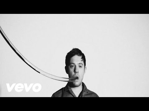
The track the idea is for is Cough Cough by Everything Everything.
My music video concept:
The band will be all wearing similar costume but will be individual to each member. For example: the colour could be different for each or one could be wearing short sleeves, another could be wearing long. The members will start off well groomed but by the end of the video have a messy look. The costume will have an "indie" style. Other bands they are similar to are 21 pilots, catfish and the bottleman and royal blood.
The Band will be standing inside a glass box which will be surrounded by fire. The band will be standing inside the box with other actors all squished close together so it looks extremely crowded. The main singer will be looking up at a camera and singing to it.There will also be the band playing their instruments in this box with the other actors standing around looking in instead. There will be other bits of set like a glass box which is filled with water with an actor in, the water in the box will increase as the video goes on. The will also be a box with another actor in which is gradually filling with smoke.


These all relating to things that could make you "cough". Instead of coughing however, on the words "Cough Cough" the video will skip almost like a glitch. Until one point in the video where one person will actually cough (probably near the end). The narrative is that even though the band are in these tough situations they're not being affected by it unlike the other people, in fact, it is making them more "alive". This creating a star image for the band members as they are seen as superior to the others and are getting power from what is happening. The song is about the power of money and how it can cause the good and the bad. It is a symbolism that there is an inescapable pull towards money and that it is not just money but everything unappealing that comes alongside it. I would like to have a more of a performance aspect with the silhouette of a dancer with money falling like rain. This all making the video fit perfectly with this specific track. For lighting, I believe red or green gels would work well at points with the overall lighting being quite dark. The video will end with the girl going under the water fully.
Music Video- Idea 1 (Do you feel alive)
12:45
The track the idea is for is Do you feel Alive by Raphael Lake & Ben Fisher

 In my concept, the location will be in will be in a derelict setting or in the woods and there will also be them standing on a minimalistic set with a white background, the band members wearing all white. Their style would be a mixture of Coldplay and Panic At The Disco. It will start of as them being still staring at the camera while there are close ups of paint dripping which correlates with the musics "dripping sound". The moment the volume increases in the song, a multiple balloons full of paint pop on the white set over the band members. At the other location coloured powder comes into shot. when the lyrics start it is the band laying in the paint and the floor covered in colourful powder while the lead singer mimes the words. In the derelict location the band are playing their instruments whilst water pours on them with close ups of the water splashing on the drums and their hair.
 In the woods there is a coloured powder fight between two groups of youths (modern tribe like), this including the band. There are moments when this is in slow motion and there is parts where there is white drawn outlines and animations flashing on their faces. The video ends with the band and the others laying in the mess like in the opening. This video fits this specific track as it is constantly saying "Do you feel alive?" and talks about "playing games"and "Give it all for it?" it all represents the bands memories of the fun they've had and how they're drawn to and urge this energy. The video fits with the star image of the band as they are the main focus of the video, the footage will draw the audiences eyes to the band members making them seem more superior.
Lip Sync
13:15
In the studio, we had three different sets;
- one with a green screen and a sofa
- one with neon lighting panels
- one in an apartment setting.
We assigned each other different roles, such as: Floor manager, playback, camera man, performer and director. These roles allowed it to be filmed properly and meant we were able to edit the film in time to the music. The director would take charge of what the cameramen and performers are doing, the performers and cameramen would do as they are told, the playback would take charge of playing the song and the floor manager would make sure everyone is ready and everything is going to plan. We learnt how to use the dolly safely, capturing everything we needed. We also learnt to focus on the play back before then focusing on the performers, this meaning the video could sync up perfectly with the music.
In the editing suite, we started off by organising and naming our rushes and then syncing each up to the music. To do this we looked at the timer that the playback held which we made sure to focus on at the start of each shot whenever we were able to so that we could sync it perfectly to the music, at points we were unable to do this method as the camera was set facing a different direction (this problem occurred on the green screen set), when this happened, we listened to the snare drum and synced it as closely as we could to that. Making sure that the music and video is synced up perfectly is vital so this is what we spent the most time doing. One thing our grouped struggled with was continuity with editing, we tried to come up with as many original ideas on set as we could by using the set in different ways or performing different routines but there wasn't many angles of the same shots. This meaning there wasn't much of an order to our video. Once we selected parts we thought were best for each section of the song, we cut and pasted the footage into a timeline which eventually turned into a longer video. We made sure to keep saving the video as we went to ensure all of the edited video didn't get lost. Editing this lip sync was more challenging for us than when making our thrillers because of the troubles with continuity and making sure it is constantly in sync with the lyrics.
Next time we will make sure to get lots of shots of the same action to ensure the video has good continuity so that the video visually looks better and the cuts would be more effective and cleaner. This tasked helped me to prepare by letting me practice syncing the music to the video and by viewing the mistakes we made and how we can change them.
My Draft Album Artwork
13:53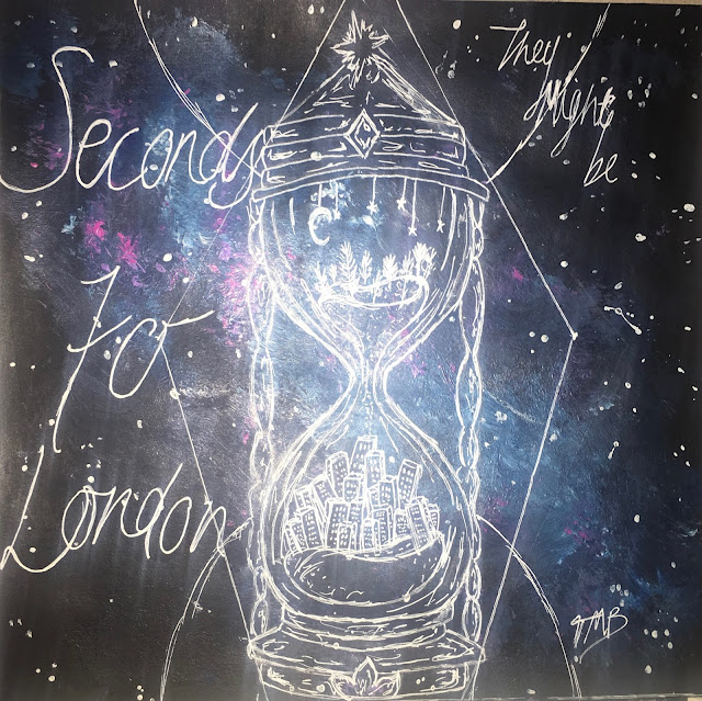


I have included the vital information that needs to be given on an album cover, this including the band and album name, the track list, artwork, a barcode, the record label, and the copyright.
In this album cover, the most important things being are the band, the name of their album and the bands products (the songs on the back). I made these things stand out by the size of the font, the positioning and the colour used. For example "Seconds to London" is in the biggest font as the main thing being advertised on the cover is the Album- it draws the audiences attention to the writing making people want to look further into it. I have gone for an illustrated cover that I have painted myself, the reason for this is because I wanted it to be organic and imperfect, this is because I wanted to show the band is indie and quirky, targeting quite a young generation that is influenced by the arts and are accepting of imperfections. It is then more relatable for the audience. I have painted an indie, galaxy style background with a design of a minute timer on top in white gel pen, inside the drawing there is countryside in the top, the sand represents the seconds going down and then at the bottom there is a city, representing London. This is an image of what the title of the album is trying to say. It suggest the bands roots and where they are now, and also the difference between the countryside and location. It also suggests that the band is again quite quirky and creative and alternative. I used black, blues and purples in my album cover so that it was eye catchy and not too simple. I used a white gel pen to do the writing and illustration on top so that it would be clear and stand out over the darker background.
 For font, I looked for inspiration online. I liked the look of this font on the 1001fonts website and wrote in a style similar to it. I think it again reinforces the idea of organic and imperfect to give the impression that the band likes uniqueness and natural things, implying the band is indie. The target audience would pick up the album because of the interest in the indie design, colours and how the genre of the band is clear. Younger generations, so current teenagers (like myself) would be attracted to the album because it is different and unique, in my opinion a lot of people my age are more accepting of different and quirky art choices therefore I feel they would have a liking to this album cover. I am showing that the band is indie-rock by the use of quite dark colours and the use of hand drawn, indie drawing alongside font that isn't neat and wouldn't usually be seen on an album. These conventions all making it easier for the audience to recognise the genre of the album and the type of things they would expect from the band. I have constructed a "star image" for the band by including their signature on the front, this making the audience feel its more personal to them and feel as though they have received something from someone that is influential. I also included on the back that they are signed to island records, who have many other artists signed to them, such as: Justin Bieber and Shawn Mendes, who both target a similar audience. This putting them up there with all the other "star images" that have been created for other artists, making the band seem as though they are better and cooler than the audience. I made the choice of not using the artists faces, this works with Dyers theory. The second paradox states that the artist/band should be both absent and present. By the absence of their faces it makes them remain anonymous and will want the audience to look into the Band more. It also proves that the bands are such "stars" that they don't need their faces on the cover to get the recognition they need. And lastly, it shows that they are in it for the music, not popularity from their looks.
Overall, I think I represented the genre well through the album cover and it would attract the target audience. I am happy with the artwork and the representation it has linking to the band and the album. If I were to improve the cover in anyway, I would add more legal information for example the year of release and the producers and i would maybe accentuate the rock side as i think it is evident it is indie but it could be made slightly clearer that it is an indie-rock band.
Designing my 1st Draft Album artwork
14:01
Band name: They might be
Album name: Seconds to London
Genre: Indie Rock
Record Label: Island Records
Track List:
- Nocturnal Interference
- Nothing but Persuasion
- Secret Joy
- Blue
- Crying Vandals
- Ineptitude
- Rule go Height
- Tell
- Ruby Delusion
- Steel Tears
- Vivacious
- Want
Below are some photos I took during the planning and designing process of my Album cover.
 |
| A design of the type of shape the design will be and the placement. |
 |
| A more detailed design, alongside placement ideas and font ideas. |
 |
| A sketch of the design for the back cover of the album and song name ideas. |
What is on Album?
03:11There is key information that needs to be on the album cover. I have made a collage of words including what should be displayed on an album.
 Also, heres a list to make it clear what should be included:
Legal information: copyright, year of release, studio, producers etc.
Record label (usually the logo as well)
Warning (if necessary) "explicit content"
Artist name/ band name
Album name
Artwork/ photo
Barcode
Track/ song list
Albums and its artwork are made for many reasons. It attracts a specific audience, it displays the genre, it markets/ sells the artist, it builds the "star" image and it is way of exhibiting the product.

Legal information: copyright, year of release, studio, producers etc.
Record label (usually the logo as well)
Warning (if necessary) "explicit content"
Artist name/ band name
Album name
Artwork/ photo
Barcode
Track/ song list
Albums and its artwork are made for many reasons. It attracts a specific audience, it displays the genre, it markets/ sells the artist, it builds the "star" image and it is way of exhibiting the product.


