Do you feel alive- Digipak and Homepage ideas
02:52
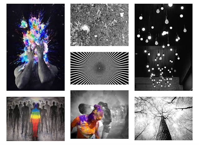
Digipak mood board: |
| http://www.gomoodboard.com/boards/Mnp9EWg1/share |
For the website visual these, I looked up wix templates and scrolled through to see which suited the artist the best. Visually i think this template was perfect. I would keep it more of a black an white theme with splashes of colours to match the digipak. The tour dates will be immediately available to see on the homepage as well as the chosen song's music video which automatically plays. I think the artists audience would like this homepage as they would be interested in seeing them live and seeing images of them.
The homepage link would be: http://www.raphandben.com/


